Ubuntu's New "Light" Style Defaults to Dark Theme?
Published on by Jim Mendenhall
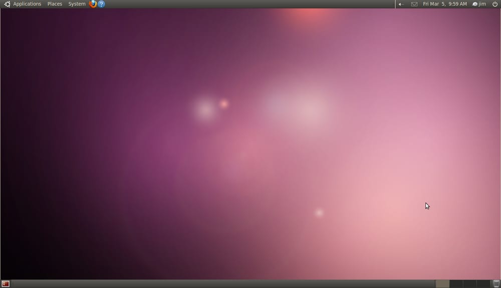
I wanted to get a closer look at the new Ubuntu “Light” styles that have been announced for version 10.04, Lucid Lynx, so I loaded up the today’s daily build in EC2. I was a little bit surprised to see that the default theme is Ambiance, a dark theme. It seems a little strange to roll out a new branding strategy called “Light” and make the default them a dark one.
The Ambiance theme seems a little half-baked, and doesn’t work well with some applications such as OpenOffice (where it becomes impossible to see the menu text). I’m sure that the Ubuntu team will work out all these bugs before the final release. Hopefully it will be fixed sooner, so that people can start writing documentation for the upcoming release with proper screenshots and videos.
One other disturbing change is the order of the window controls. For some reason, they’ve switched the position of the minimize and maximize buttons. I can’t imagine why they’d do such a thing, and if left in the final release, this will likely cause problems for millions of Ubuntu users. Please don’t mess with the window controls, please!
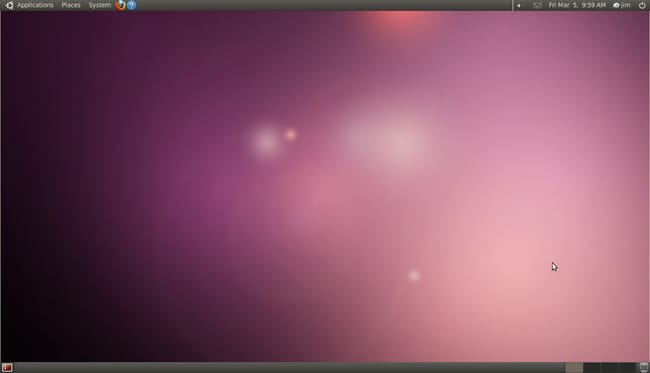
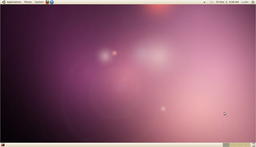
Here are some screenshots of the dark and light themes. Overall, I think they are pretty nice. There’s still a lot of brown and earth tones mixed in with the orange and new Ubuntu purple. I think it’s a fine start, and I look forward to seeing these themes develop over the next few months and years.
What do you think of the new Ubuntu look? Leave your comments below!
Ambiance


Radiance


